Process image poster
BENV1010 Kristina Argiropoulos
Saturday, April 25, 2020
Monday, April 6, 2020
BENV1010 Assessment Task 3
Week 5:
Models:Paper:

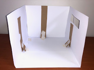
Scale: 1:10
This paper model was the first model I made and was a very basic construction of my room. I found the paper difficult to work with at it had little structure, at this larger scale I found paper was not an appropriate material. As a result I made made cardboard supports to hold up the walls however I did not like the appearance of it. Also the material felt too thin too glue so I used tape. However the paper alone had a cleaner and nicer finish that I preferred than the cardboard. Creating creases and folds in the paper to glue would be good. Photography also needs plain background and needs clearer/brighter light.
Cardboard:
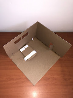

Scale 1:10
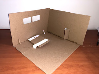
This was my first cardboard model and was also very basic. It was easier to construct as it held its structure however since there was only two walls I had to create some structure for it. This model was valuable as it helped me grasp scale better, the door is too small for the scale of the room. I began testing the construction of furniture. The glue could also be seen which taught me to be more precise with application. Similar issues with photography. In both I attempted to digitally remove the background to see how it would look
Testing shape
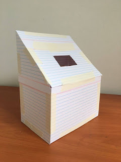
This was a model made out of palm cards, I made it because I was interested in a triangular prism shape of a room. The rectangular cut out was intended to be a light source such as a roof window or skylight. If I was to make this again, I would remove the back wall in order to show the inside of the room with a clearer scale

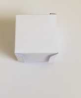

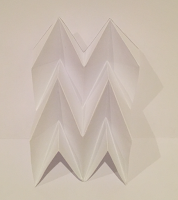
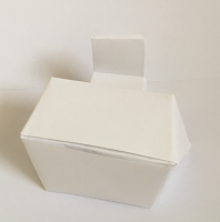
Here I used origami and folding techniques to create different design. I was able to create furniture such as a desk, char and table. This was something I wanted to incorporate into my models. I also used a net to create a cube with the intention of testing different to ways of creating the shape. The tessellating origami design was also an aspect I wanted to use in my models. Using tabs was interesting technique that I wanted to use later for paper models. I used the miura folding technique.
Week 6:
Development of model:
Used origami folding techniques to create furniture
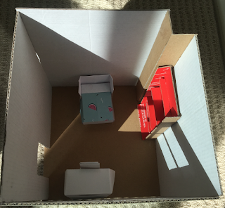
Scale: 1:20
Additional light source:
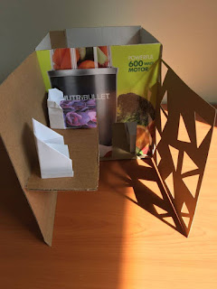
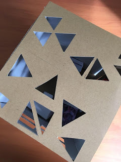
I attempted to add a natural light source through creating a geometric shape pattern
Creating additional space

Week 7:
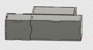
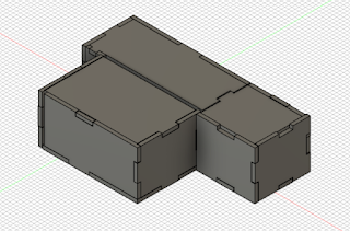

I struggled with the technical aspect of creating this as the pieces did not always connect and lay out as I had anticipated. I also felt that the final appearance was not as flush as the demonstrated tutorials. I would have liked to make a more interesting design
Practising with photographing light:


Scale: 1:40
Placing a light source inside the model created a soft light inside the model which looked good


Scale: 1:30
This version created very interesting shadows which I found were good to photograph particularly because it gave the ability to move the light source and photograph from different angles.
Adding Human Scale:


Both of these models were to a scale 1:30 so adding human scale was significantly easier. Adding this in allowed me to observe that my model was generally to scale, the window was at correct eye height and the bed was the correct dimensions to fit the space and scale.
Week 8:

Rendering:
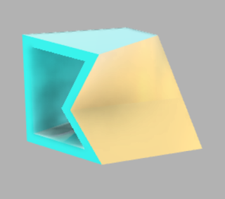
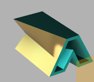
The colours looked really good with this model, especially from the back where the different shadows and contrasts displayed better. From the front the blue was very turquoise and fusion 360 struggled to properly display it
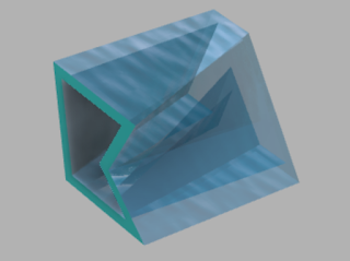
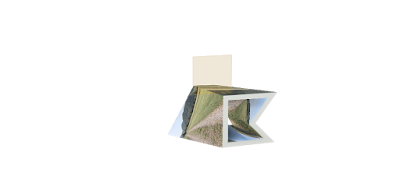

Photoshop materials to models:

Reflection:
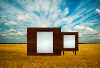
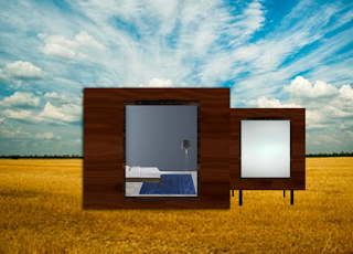
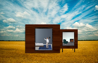
I choose this model because I thought the shape was interesting and that it would be intriguing to explore what the interior would consist of. I chose a dark wood for the exterior and utilised the window to create depth of space. The first version was very basic, initially just matching the structure of the model however with the next two I decided to fill in the space of the room which looked much better. I like how this turned out. The first room is a bedroom while the next room is a possible study or reading space with a fireplace. I did struggle to warp the carpet appropriately, so while the rest of the room appears to be correct, the rug does not look flat enough

Reflection:
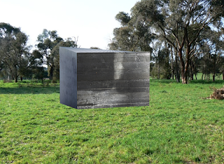
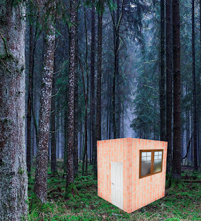
This was the same model at a different angle. As a result the side room is hidden. I really liked the materials, feels like it fits better with the background. Initially I did think that I should have duplicated the front material in order for the slats to be smaller but with the final result, I am undecided. I tried creating a roof and distorting it so that it appeared as though the view was slight higher than ground level. I made this second version just to test out the material, I duplicated it so that the bricks were smaller, this did feel more to scale
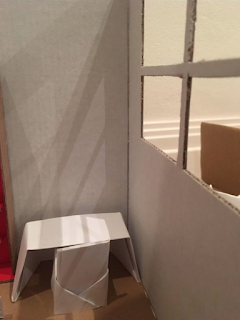

 --> cut image in window
Reflection:
This was the interior of a model that I added materials too. I was happy with the final product, although some aspects worked better than others. The furniture, back wall and warp of window was effective. I also though the image through the image looked good. However I really struggled to correctly fit the wall beneath the window. It looks as though it is pushing outwards. I also chose to change from 4 square windows to three rectangular shaped ones. I think it worked much better and allowed me to more cohesively to create a window and background
Week 9:
Draft statement (238 words, need to cut)
Throughout the drafting and design process, an in-depth reflection was greatly useful and became an integral component of my work. I consciously spent more time reflecting as I recognised that it forced me to gain a greater and more comprehensive understanding of the strengths and weaknesses of the models I had created along with the other submissions. In this way, it also provided me a direction forward particularly in the model making process as there were several iterations of designs. I recognised that my use of design principles were sometimes inconsistent such as scale, certain aspects such as doorframes and origami furniture were too small and mismatched with the scale of the room. My reflection also led to me to continue using geometric shapes in design processes which led to a cubic iteration of a room that I liked. It also allowed me to reflect on my process, by using cardboard I found that whilst my process was changing the design often looked the same. This led me to using paper on a smaller scale which was significantly easier to work with than cardboard and produced a cleaner final product. I utilised my reflection from my initial models to change the process for the paper models, the process I developed was effective and one I used for several iterations. Through identifying specific challenges and successes in the self-reflection process it allowed me to communicate my designs more effectively
Draft Presentation:
The development of different model forms as a method of communication in the built environment presents challenges and opportunities in developing an effective style. The different nature of the models presented unique challenges and successes which I was able to observe and become aware of through the process of self-reflection. The brief for the physical models has less constraints than the others which allowed me to creatively communicate different and unique design elements. I was able to successfully incorporate origami and paperfolding as it allowed me to create interesting furniture such as chairs, table and desks. I could also create different shapes such as a cube shaped room and unique textures through a modified miora fold. The cube form created a design I really liked and found interesting. The main cube is a room such as a living space or even potentially a bedroom while the adjacent cube I envisioned as being a reading or study space. It was also a way of making a structural change to the room and creating additional space. The final result I considered an achievement as it looked effortless and simple which was the goal. I also became fascinated with developing a room where a single window was the dominant feature on the wall. I encountered a challenge where several iterations looked bare due to the open space. However, upon adding a translucent paper backing the finish became much nicer and created the desired effect. As a result I used this technique for a further iteration. Also when light is place inside the room, it comes through as a soft light which I liked.
- Using geometric shapes such as triangles created interesting lighting effects
- I struggled in creating the floor plan on fusion 360 --> difficulty in ensuring edges were flush and meeting correctly at the join
Sunday, March 1, 2020
Colour Swatches and site activities
Colour Swatches:


On site activity:
Lines
Shapes (geometric or organic)
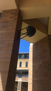
Direction (of lines)
Size/ Scale
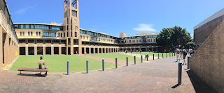
Texture
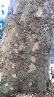
Colour
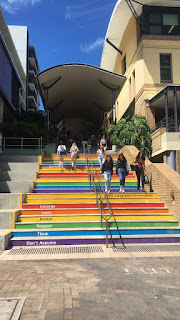
Balance
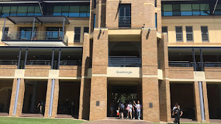
Proximity
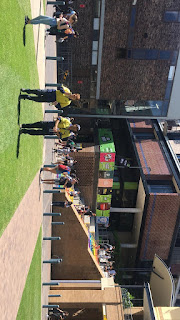
Alignment
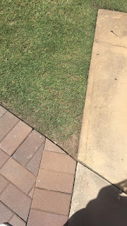
Repetition or pattern

Contrast
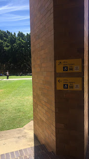
Space
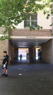
Group Activities
Public Art

Signage

Branding

Street Furniture

Bollard

Photoshop:

Floorplan:
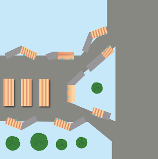
Infographic:
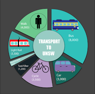
Week 1:
Models:
Paper:


Cardboard:

Testing shape

Week 6:
Development of model:
Used origami folding techniques to create furniture

Additional light source:


Creating additional space

Week 7:


Week 8:

Subscribe to:
Comments (Atom)
-
Week 5: Models: Paper: Scale: 1:10 This paper model was the first model I made and was a very basic construction of my room. I fou...
-
Colour Swatches: On site activity: Lines Shapes (geometric or organic) Direction (of lines) Size/ Scale Textur...


